You want a calm, polished bedroom that doesn’t scream “Pinterest fail,” right? Good. Minimalist color palettes do the heavy lifting so you can relax without overthinking fifty shades of greige. Below are 7 Minimalist Bedroom Color Palettes that look expensive, feel serene, and are ridiculously easy to style—even if your nightstand is currently a water glass museum.
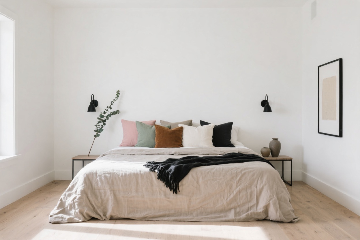
1. Soft White + Warm Beige + Natural Wood
This is the minimalist starter pack: airy whites, cozy beiges, and a hit of wood to ground it all. The vibe is spa-like without feeling sterile. Think creamy walls, beige linen bedding, and a walnut or oak headboard that adds just enough character.
Why It Works
White brightens, beige softens, and wood tones warm things up. Together, they read clean but not cold—aka minimalist heaven.
Pro Moves
- Paint: Soft white with a warm undertone (not bluish). FYI, warm whites play nicer with wood.
- Bedding: Layer white sheets with a beige duvet and throw.
- Accents: Keep metals simple—brushed brass or matte black for lamps and hardware.
2. Greige + Charcoal + Crisp White
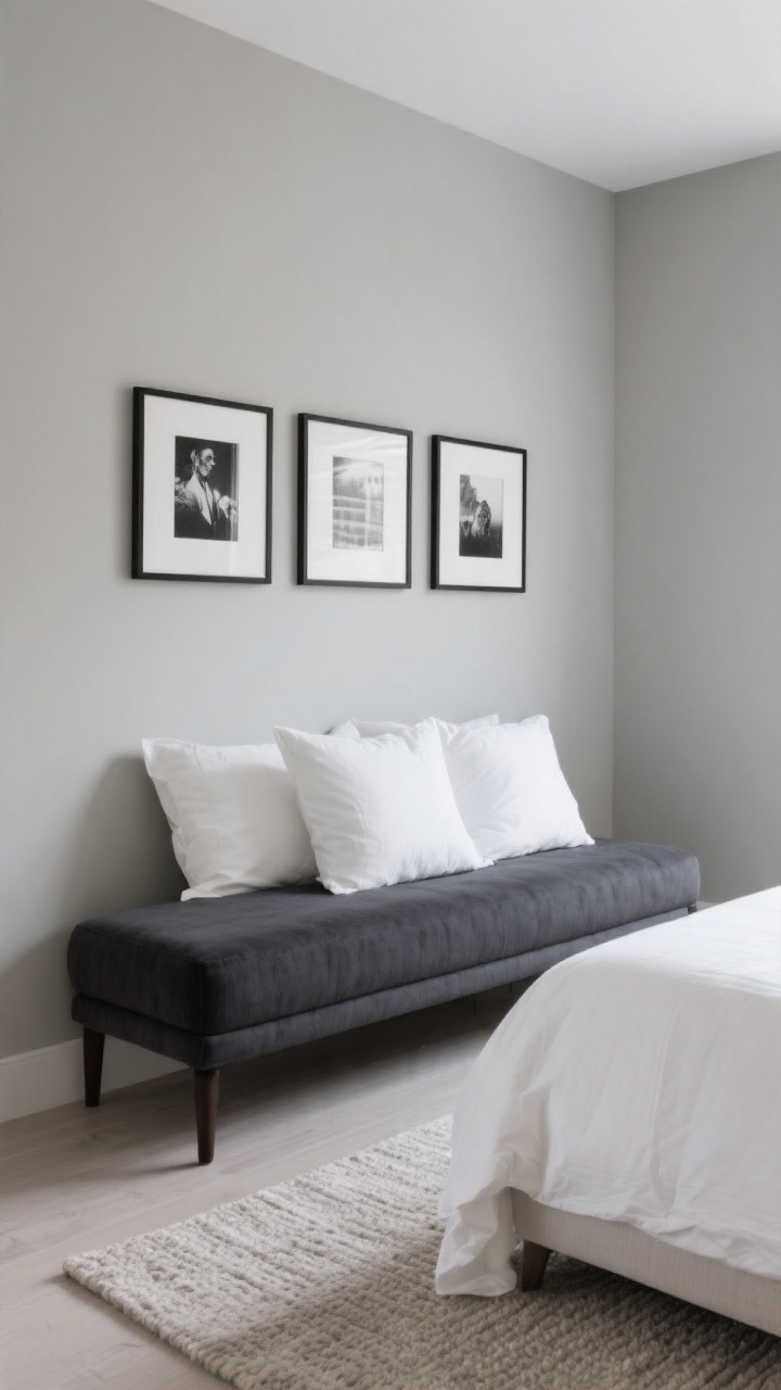
When you want sophistication without drama, go greige. Add charcoal for depth and white for balance. The result? Understated luxury that looks curated but not try-hard.
Why It Works
Greige is the Switzerland of neutrals—plays well with warm and cool tones. Charcoal anchors the room without the harshness of black, and white keeps everything fresh.
Pro Moves
- Walls: Greige with medium depth so it doesn’t wash out.
- Textiles: Charcoal throw or upholstered bench; white shams to lighten the bed.
- Art: Minimal black-and-white prints in thin black frames.
3. Stone Gray + Soft Taupe + Black Accents
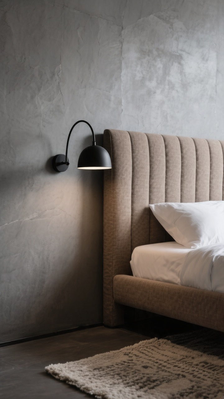
For a cool, gallery-style bedroom, try stone gray on major surfaces, taupe for warmth, and strategic hits of black. It’s moody but still minimalist—like a whisper, not a shout.
Why It Works
Stone gray reads modern, taupe keeps it from feeling icy, and black adds contrast for that clean, edited look.
Pro Moves
- Headboard: Upholstered taupe headboard against gray walls = chef’s kiss.
- Lighting: Black swing-arm sconces for function and silhouette.
- Rug: Neutral wool rug with subtle pattern to add texture, not chaos.
4. Warm Sand + Terracotta + Cream
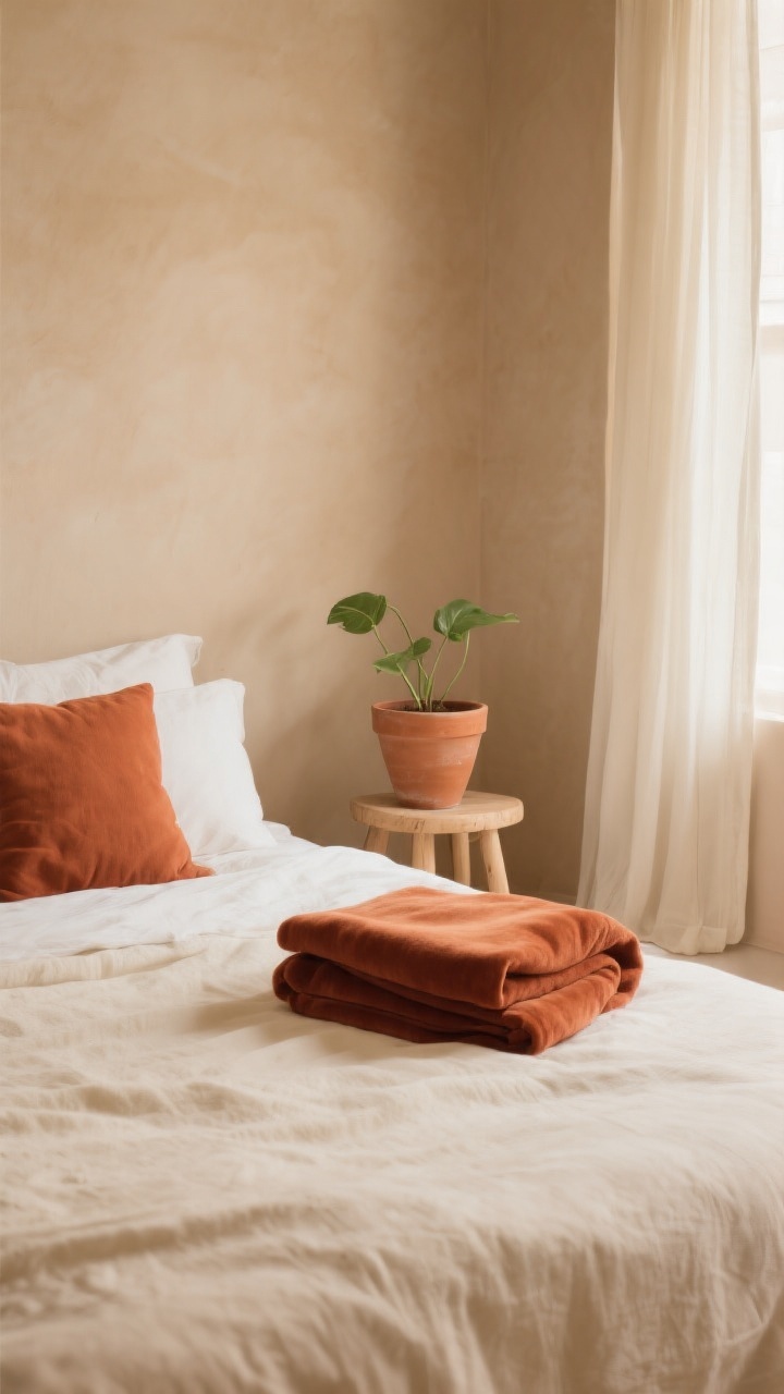
Want minimalist, but with a little soul? Try warm sand walls, terracotta accents, and creamy textiles. It’s like sunshine without the squint—earthy, calm, and unpretentious.
Why It Works
Sand is a gentle neutral that flatters warm skin tones (hi, mirror selfies). Terracotta gives a muted color moment without crowding the palette. Cream keeps it soft and airy.
Pro Moves
- Pillows/Throws: Terracotta linen or velvet in small doses.
- Planters: Unglazed clay to echo the palette.
- Curtains: Creamy sheer panels for glow-y morning light.
5. Misty Blue-Gray + White + Brushed Nickel
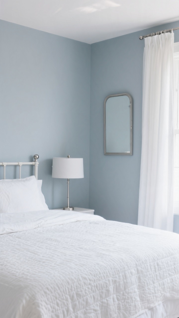
For the “I sleep like a cloud” crowd, this palette is a dream. Misty blue-gray walls, clean white bedding, and cool metallics create a quiet, coastal-adjacent look without shells everywhere. It’s fresh, calm, and insanely easy on the eyes.
Why It Works
Blue-gray lowers visual noise (and maybe your stress). White pops against it, and brushed nickel accents feel crisp without screaming “industrial.”
Pro Moves
- Walls: Choose a blue-gray that’s more gray than baby blue—grown-up, not nursery.
- Bedding: All-white with a textured quilt to avoid flatness.
- Fixtures: Nickel curtain rods and simple drum lamps to tie it together.
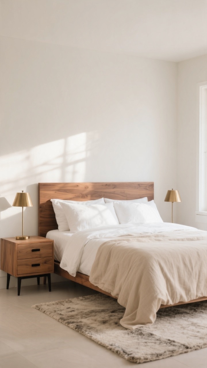
6. Black + White + Walnut
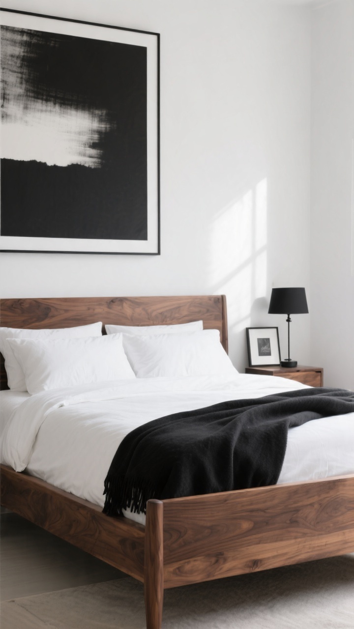
Minimalist, but make it bold. The black-and-white combo is timeless, and walnut steps in to keep it from feeling graphic-novel stark. If your space needs edge and warmth, this is your winning trio.
Why It Works
Black and white give maximum contrast and clarity. Walnut adds organic richness so the room stays livable, not lab-like.
Pro Moves
- Bed Frame: Walnut bed with crisp white bedding and a black throw.
- Art: One oversized black-and-white piece—skip the collage wall clutter.
- Balance: Keep black in accents (lamps, frames, hardware), not giant surfaces, unless your room gets strong natural light.
7. Mushroom + Ecru + Olive
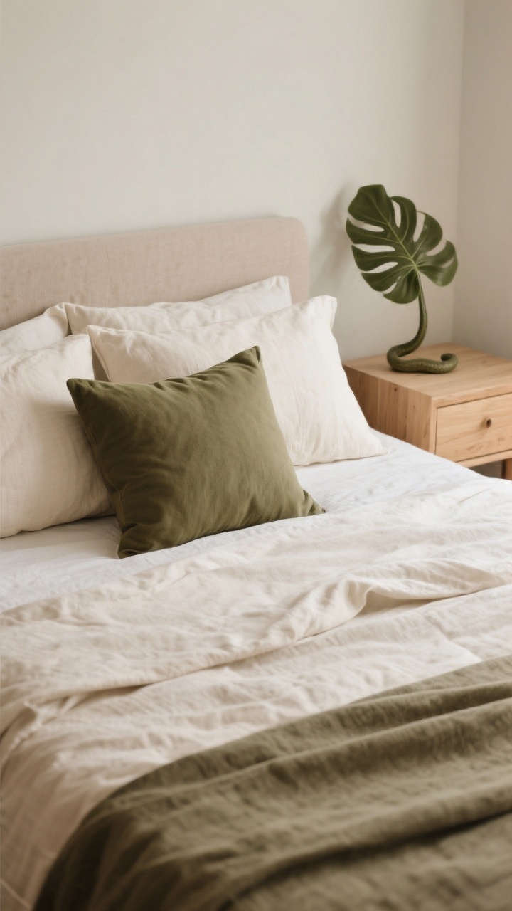
Earthy, elevated, and totally chill. Mushroom (that soft brown-gray), ecru, and muted olive create a zen cocoon you’ll actually want to get to bed early for. It’s minimalist with a tiny woodland whisper—no cottagecore cosplay required.
Why It Works
Mushroom is complex enough to feel designer-y. Ecru lightens the palette, and olive adds a natural, low-key color that ages well.
Pro Moves
- Textiles: Ecru linen duvet, mushroom shams, olive lumbar pillow for depth.
- Furniture: Light oak or ash to keep the mood airy.
- Greenery: One sculptural plant to echo the olive tones—snake plant or olive tree (faux is fine, IMO).
Quick Styling Rules That Work With Any Palette
- Limit yourself to three core colors. Two neutrals + one accent is the sweet spot.
- Play with texture, not more color. Linen, bouclé, wool, ribbed ceramic—texture = interest.
- Repeat colors at least three times. It looks intentional, not accidental.
- Mind undertones. Warm with warm, cool with cool; mixing can get muddy fast (unless you’re very confident).
- Let light guide you. North-facing rooms love warmer tones; bright rooms can handle cooler grays and whites.
Bottom line: pick a palette that makes you exhale the second you walk in. Keep it tight, repeat it smartly, and let texture do the heavy lifting. Your bedroom will look pulled together, calm, and—bonus—way more expensive than it actually was. Now go fluff that duvet and live your minimalist best life.