If you’re chasing a clean, effortless look, these large-format grey backsplash ideas are your secret weapons. They telegraph calm, scale up light, and make everyday cooking feel like a luxury routine. Let’s dive into patterns, textures, and practical tweaks that actually work in real kitchens.
1. Go Monochrome Matte for Sleek Sophistication
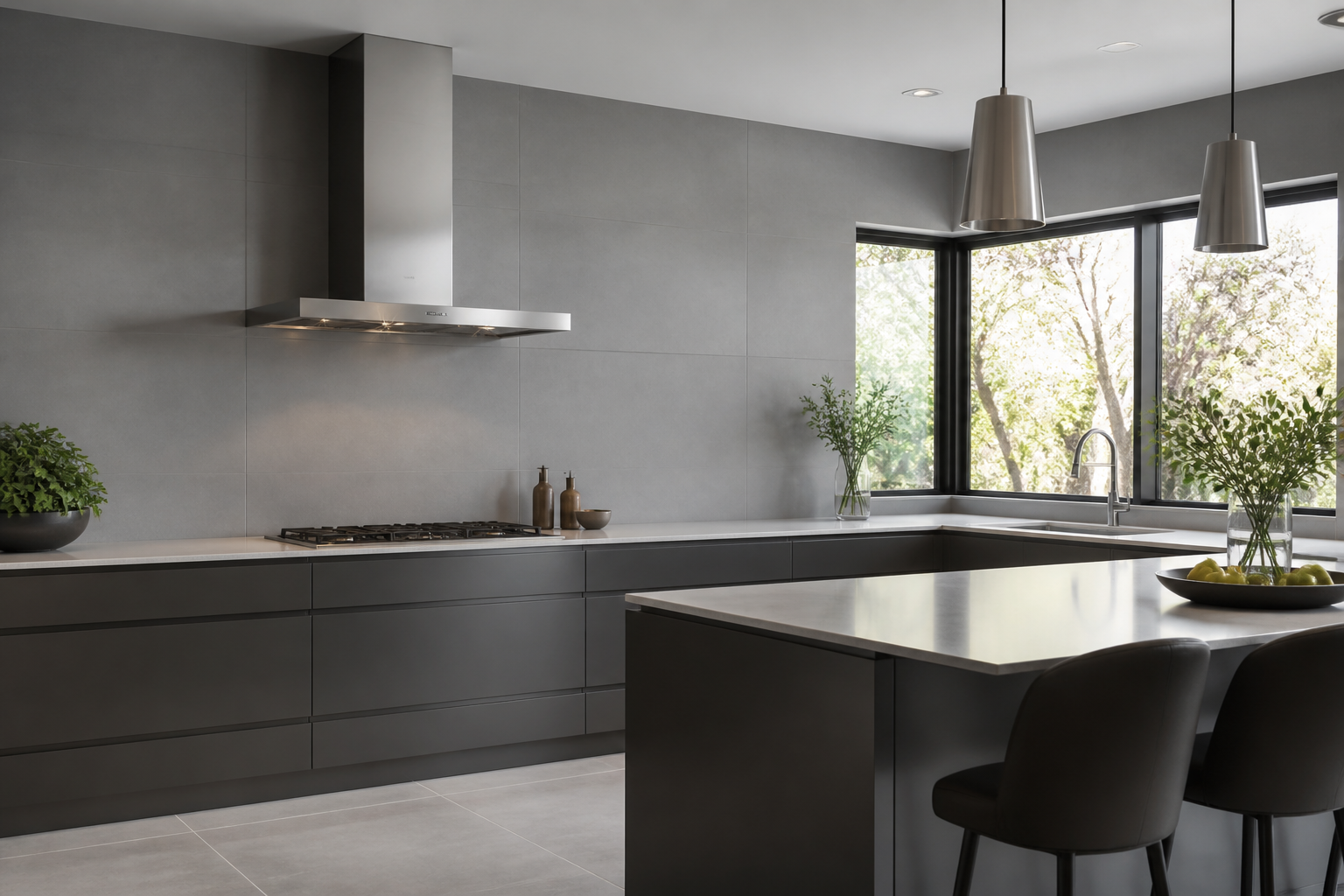
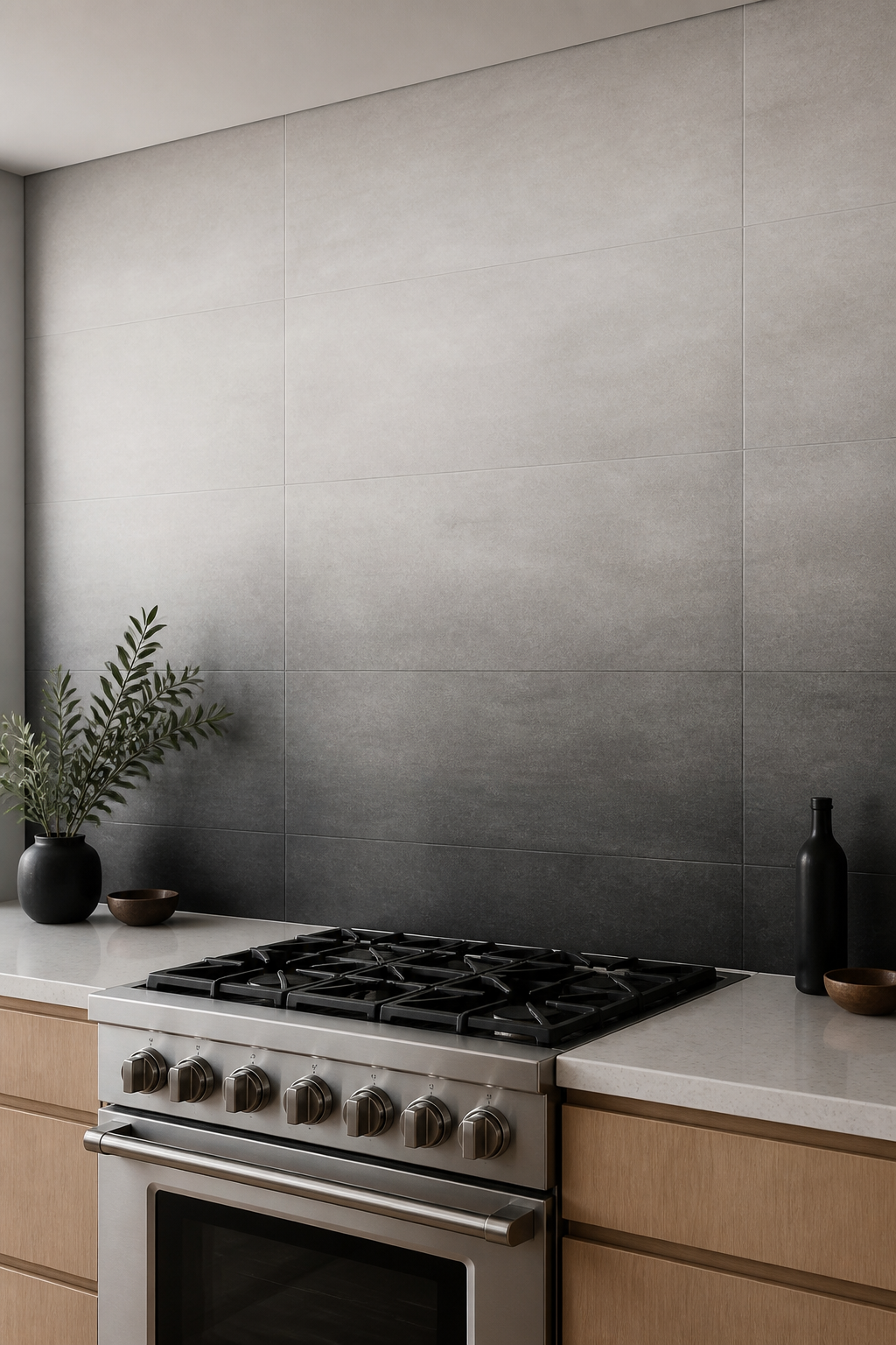
Matte grey tiles in a large format give you a seamless, refined backdrop that hides fingerprints and keeps the footprint tidy. This option feels calm and modern without leaning sterile.
Why it’s awesome: It’s low-maintenance, timeless, and pairs with almost any cabinet color. FYI, matte finishes can show slight texture variation, which adds depth rather than dullness.
Key Points
- Choose at least 24×48 inches for major impact
- Pick a cool grey with blue undertones for a crisp look
- Use minimal grout in a near-matching shade
End result: a room that reads as serene and expansive, perfect for small kitchens or loft spaces.
2. Subway-Style Large-Format Tiles for Timeless Flow
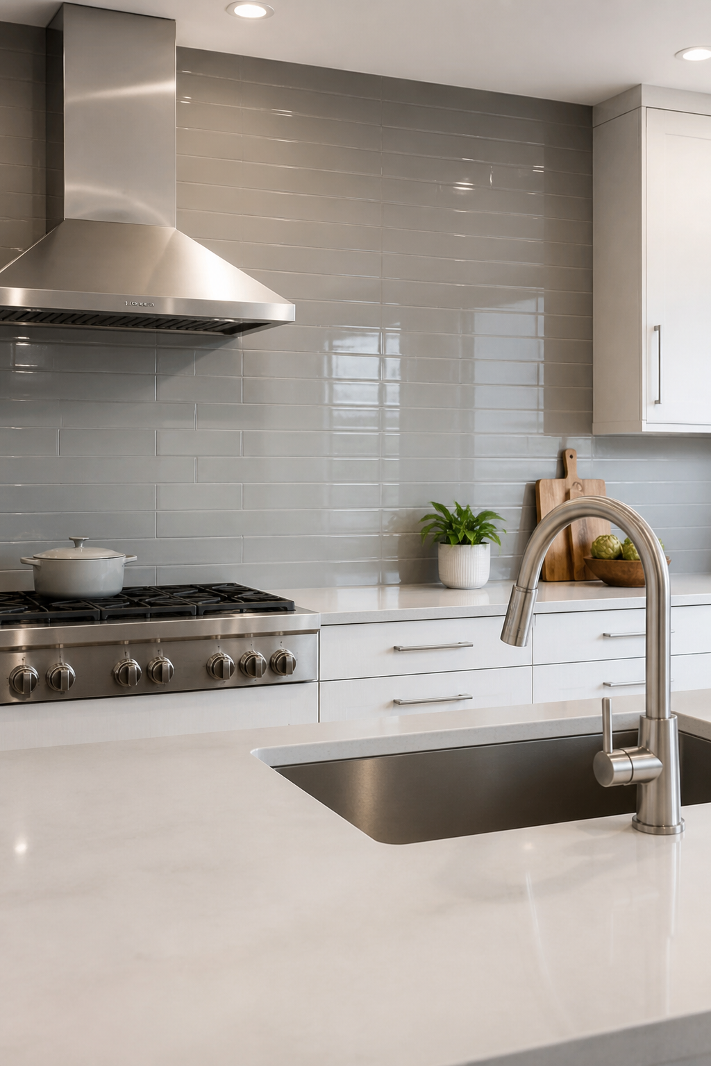
Classic subway layout, but oversized. It’s the best of both worlds: familiar shape with a modern scale. You’ll get that gallery-wall brightness from the grout lines while the tile size keeps things contemporary.
Why it’s awesome: It visually elongates walls and coordinates with stainless hardware for a cohesive kitchen vibe.
Tips
- Use a 9×36 or 12×48 format
- Opt for a light grey grout to minimize line noise
- Consider a subtle vertical offset (staggered) for movement
End note: the look stays flexible as your cabinets or countertops evolve.
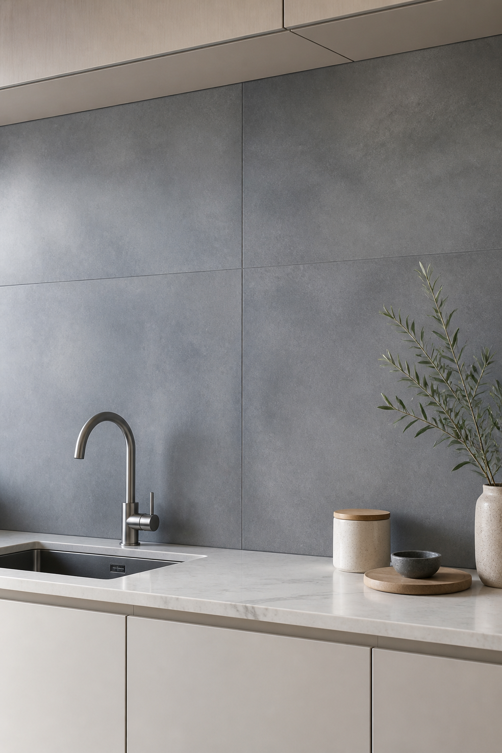
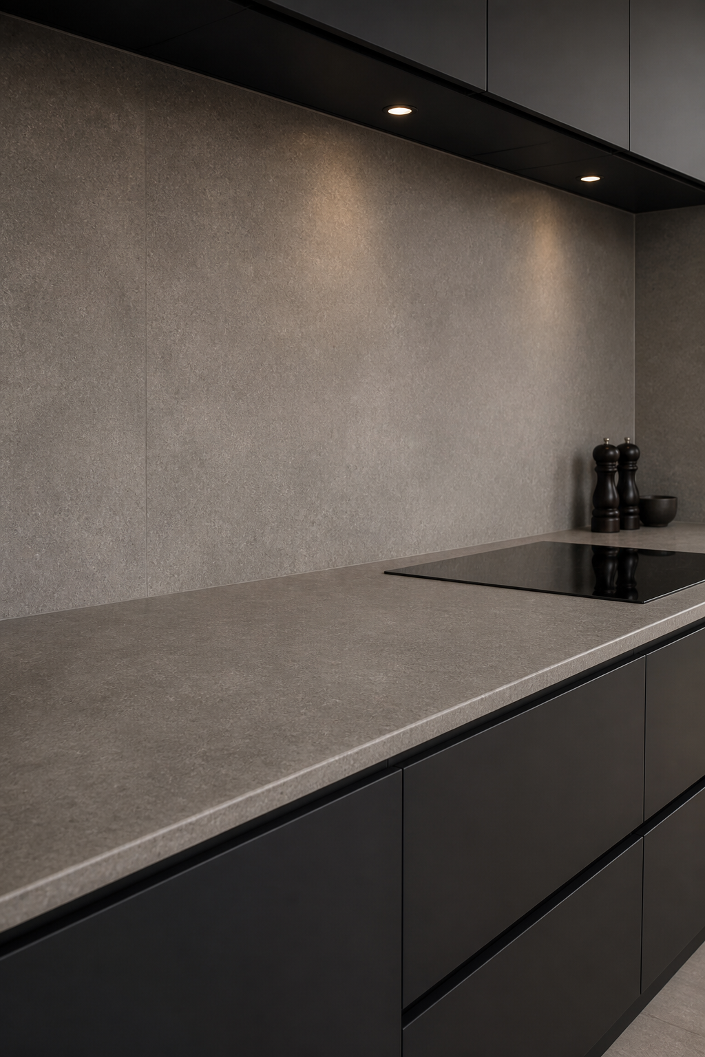
3. Concrete-Effect Large Tiles for Urban Minimalism
Concrete-look tiles in big slabs deliver an industrial yet refined aesthetic. They’re forgiving with texture and color shifts, which can hide minor imperfections nicely.
Why it’s awesome: Practical for busy kitchens; the pattern reads sophisticated without feeling cold.
Highlights
- Prefer cooler greys with gentle marbling
- Seal to protect against splashes while keeping sheen low
- Pair with matte black or brushed nickel accents
Bottom line: a bold, modern canvas that ages beautifully with your kitchen upgrades.
4. Bi-Color Gradient: From Light to Dark in One Sweep
A dramatic gradient across a single wall creates depth without clutter. Large-format tiles make the transition smooth and almost seamless.
Why it’s awesome: Adds visual interest without introducing pattern chaos. It’s like a subtle mural you can live with daily.
Implementation
- Start with lightest grey near the upper area and darken toward the bottom
- Keep grout colors close to tile shades for soft transitions
- Limit total color shifts to 2-3 levels
Pro tip: gradient works great behind a stove where you want a focal but not busy backdrop.
5. Large-Format Porcelain with High-Gloss Finish
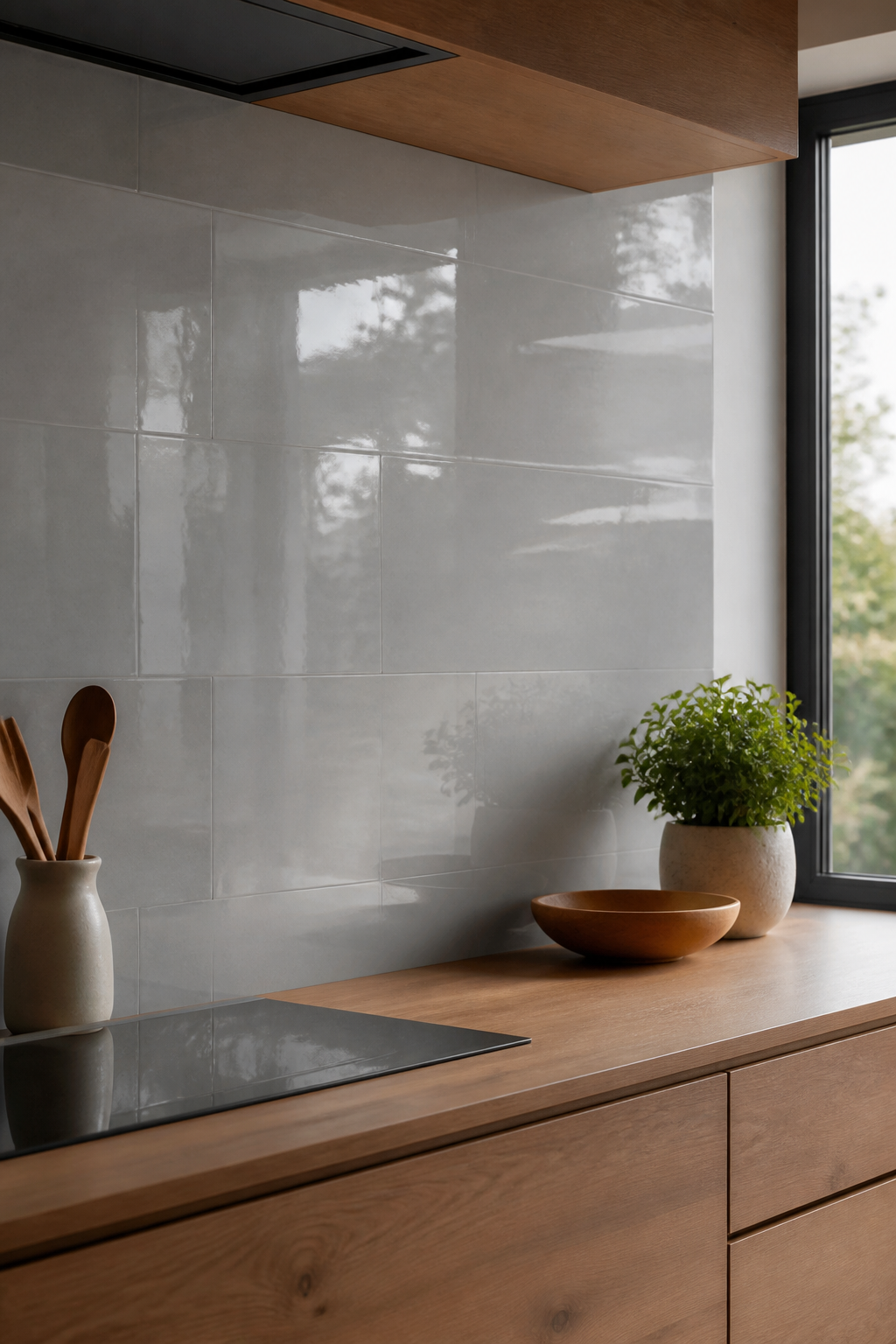
Yes, you can have glassy shine in a minimalist kitchen. A high-gloss large porcelain tile makes surfaces reflect light, expand the space, and still feel calm if you stay in cool grey tones.
Why it’s awesome: Easy wipe-down, dramatic light play, and a modern edge that still carries warmth when paired with warm woods.
Notes
- Be mindful of glare; ensure lighting doesn’t create hotspots
- Install with staggered joints to minimize visible seams
- Wipe-down regularly to maintain that glossy surface
End benefit: a crisp, showroom-worthy kitchen that’s surprisingly forgiving in daily use.
6. Large-Format Hex Tiles in Subtle Grey
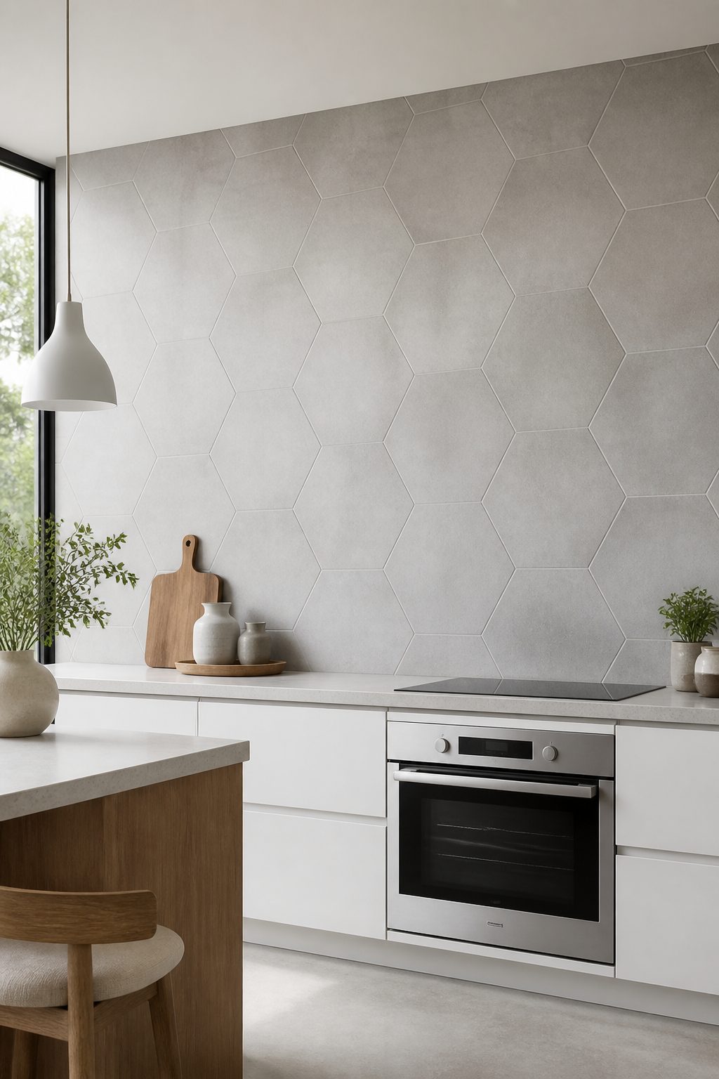
Hex tiles aren’t just for small spaces—large-format hex shapes in soft grey bring a unexpected geometric twist while staying minimal.
Why it’s awesome: Adds a hint of personality without shouting. Geometry gives a contemporary vibe that’s still versatile with decor.
What to Know
- Go for a matte or satin finish to avoid excessive reflectivity
- Choose near-monochrome grout to keep lines subtle
- Consider a full-wall installation to amplify the size of the room
Bottom line: this choice is for design lovers who want a quiet nod to pattern.
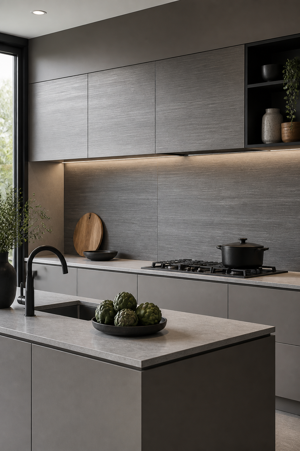
7. Textured Slate-Look Panels in Oversized Formats
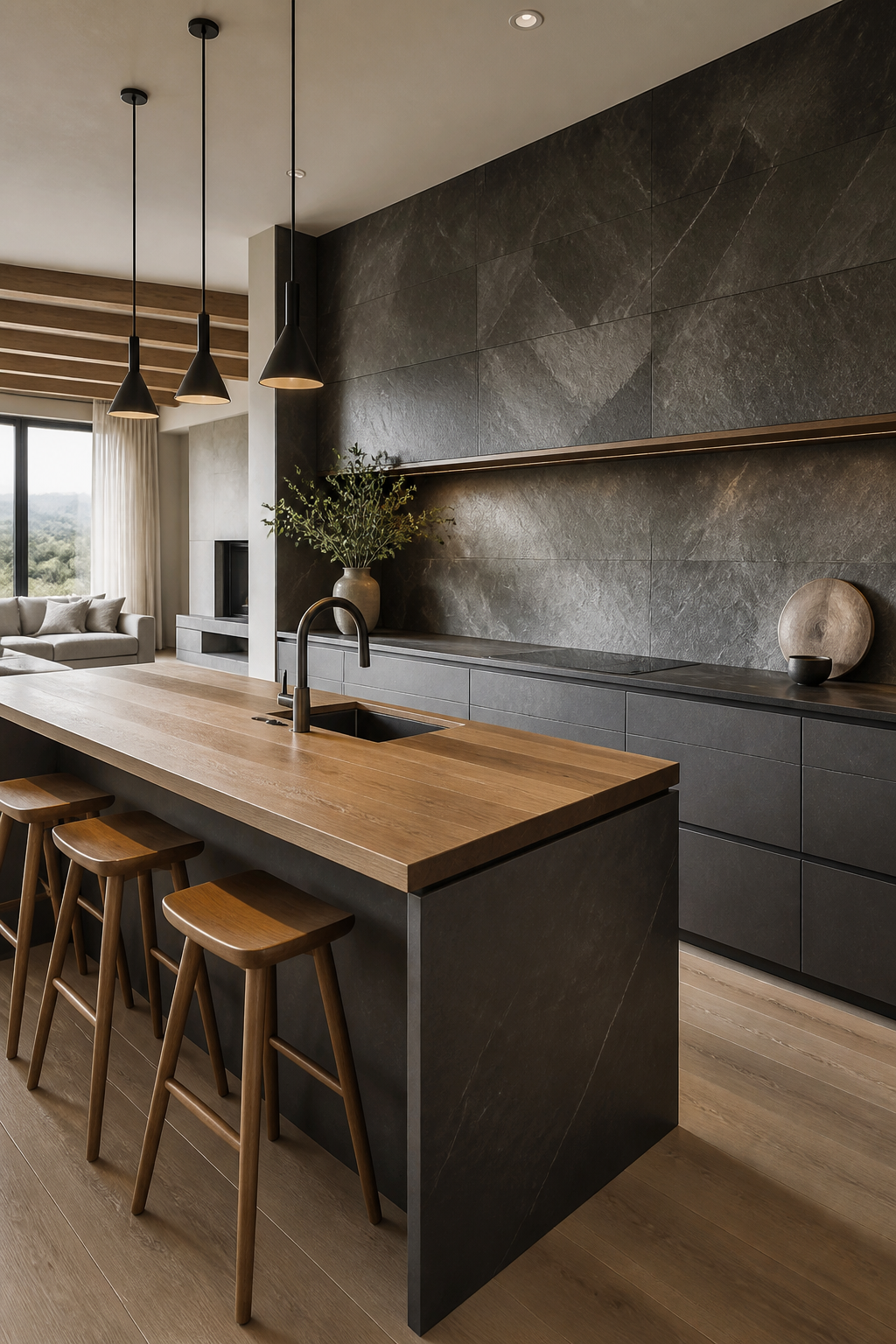
Slate-inspired slabs in large sheets combine natural texture with the clean lines of minimalism. Expect tactile interest and a grounded feel.
Why it’s awesome: It brings a rustic-luxe vibe that still reads polished and refined.
Tips
- Look for tiles with engineered surface for consistency
- Keep edges simple and avoid busy borders
- Pair with matte metals and wood accents for warmth
Use case: great for open-plan kitchens that bleed into living areas where texture matters.
8. Polar White with Grey Veining for Subtle Drama
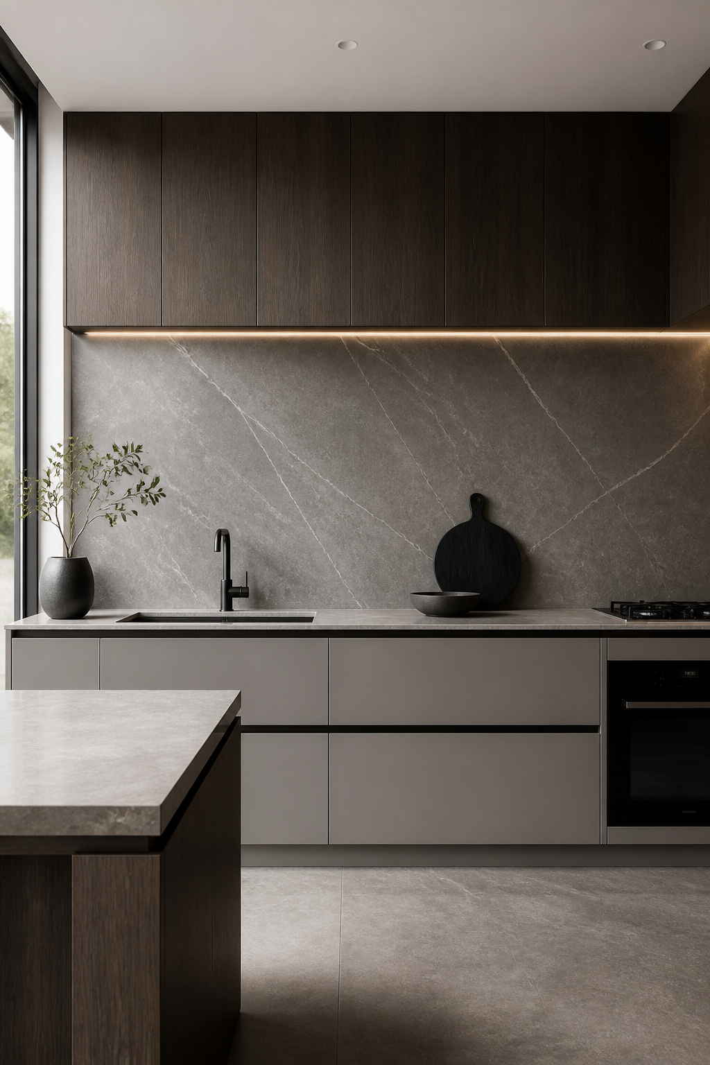
Even within grey, you can add a touch of drama with veining that feels like marble but is built to last. Large-format panels show off the veining in a controlled, elegant way.
Why it’s awesome: It elevates the kitchen without shouting, ideal for a minimalist space that wants a touch of luxury.
Notes
- Pick veins that are soft and evenly distributed
- Finish should be satin to balance sheen and practicality
- Seal periodically if the tiles aren’t fully porcelain
Conclusion: you get a high-end look with everyday practicality.
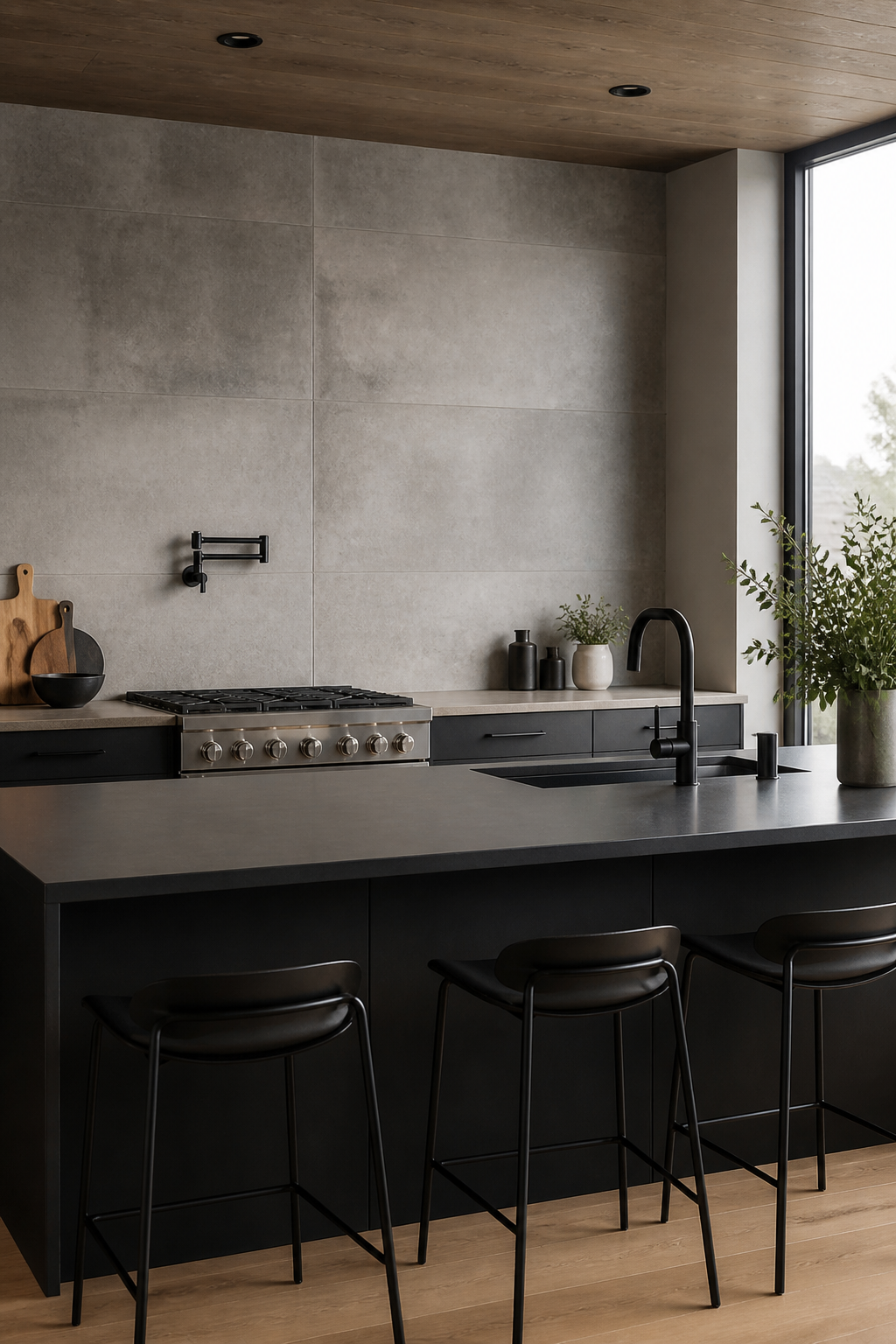
9. Charcoal Frame: Deep Boundary that Feels Grounded
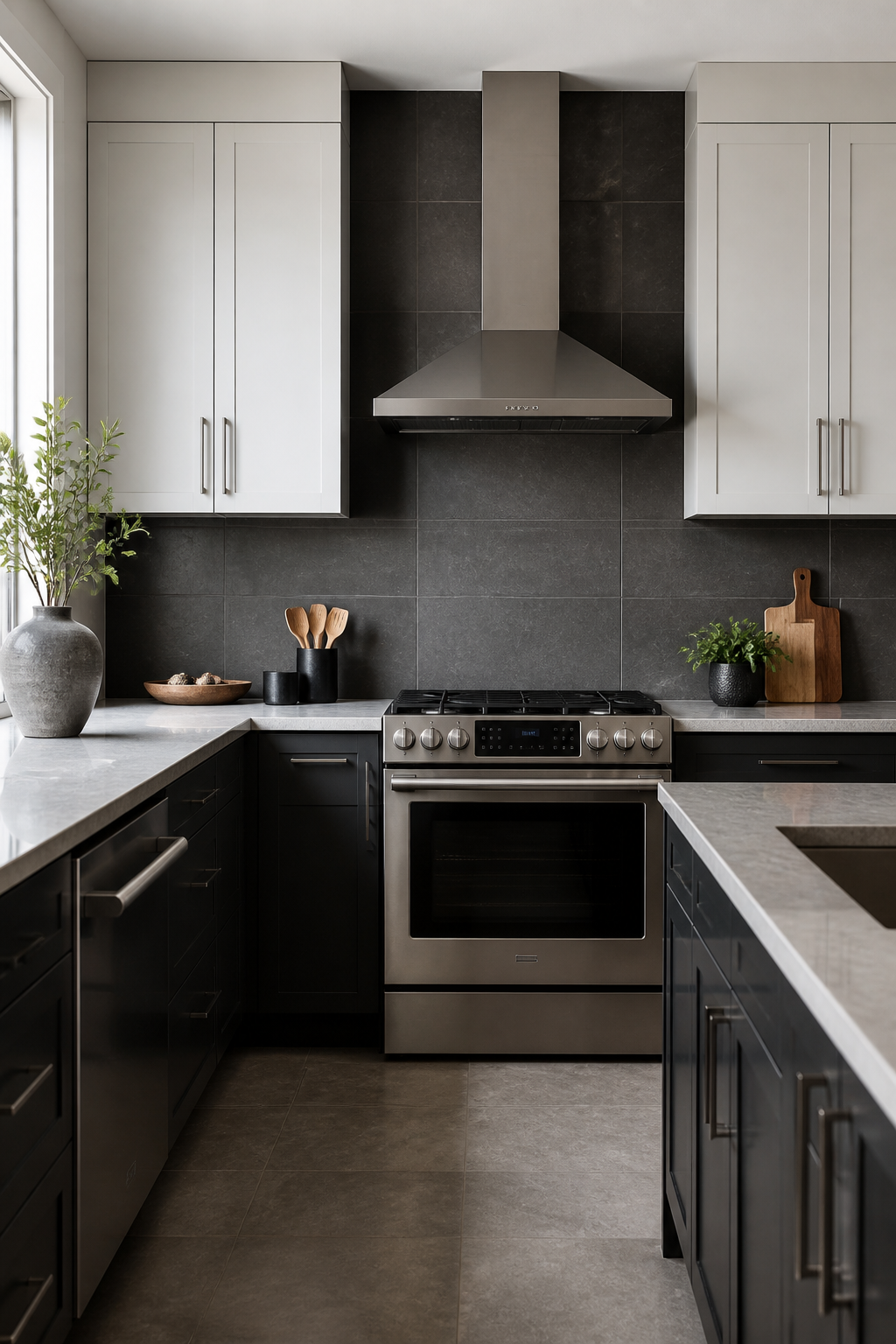
Dark presents in large panels can ground a minimalist kitchen. A charcoal or charcoal-grey backsplash creates a striking boundary while keeping the room feeling calm and collected.
Why it’s awesome: It hides kitchen messes better than lighter tones and adds a strong focal anchor for appliances and cabinetry.
Tips
- Balance with lighter upper cabinets or countertops
- Use brushed nickel hardware to echo cool tones
- Consider larger grout lines for a bold, modern feel
When to use: in high-traffic kitchens you’ll appreciate the forgiving, sophisticated vibe.
10. Brushed Texture Panels for Subtle Depth
Not every tile needs to be perfectly flat. Large-format brushed textures give subtle depth and a tactile experience without breaking the minimalist rulebook.
Why it’s awesome: Texture hides fingerprints and minor scuffs while keeping the look clean and contemporary.
What to look for
- Surface texture should be even across panels
- Match texture with cabinet finishes to avoid busy contrasts
- Use a semi-matte or satin finish to balance light reflection
Bottom line: texture done right feels expensive and thoughtful.
11. Integrated Panels: Seamless Wall to Counter Transition
Last but not least, consider large-format tile systems that blend from wall to countertop. It creates a single, uninterrupted plane that screams minimal chic.
Why it’s awesome: No visual breaks means your space feels bigger and easier to clean—hello, efficiency.
Practicalities
- Choose a tile system with matching edge profiles
- Ensure the grout lines are consistent for a seamless look
- Coordinate with a continuous countertop edge treatment to avoid interruptions
Final thought: a bold, cohesive backdrop that foregrounds your appliances and decor.
With these 11 ideas, your minimalist kitchen can feel expansive, calm, and undeniably stylish. Trust me, the right large-format grey backsplash is the easiest upgrade you’ll ever make—and it ages with you as your space evolves.
Ready to pick one and start a small renovation buzz? Dive in, measure your space, and pick a tile option that makes you smile every time you cook.